In the fast-paced world of the financial markets, understanding the dynamics of price movements is crucial for traders and investors. This is where technical analysis comes into play. By examining historical market data, technical analysis empowers individuals to decipher patterns and trends, enabling them to make informed decisions about buying and selling assets.
Throughout this article, we will delve into the fundamentals of technical analysis. We will explore the tools and techniques used, such as price charts, support and resistance levels, moving averages, oscillators, trendlines, volume analysis, candlestick patterns, Fibonacci retracement, and various trading strategies. By mastering these concepts, you will gain a deeper understanding of market dynamics and equip yourself with the skills to make more informed trading decisions.
Technical analysis is an approach used by traders and investors to analyse financial markets and make more informed trading decisions. It involves studying historical price data, chart patterns, and various technical indicators to forecast future price movements. By understanding the basics of technical analysis, traders can gain insights into market trends, identify potential entry and exit points, and enhance their overall trading strategies.
Said to have been invented in the 1700s in Japan, Japanese candlesticks, or a candlestick chart, is an information-dense technical analysis tool that shows information about the day’s high and low, and opening and closing prices all on the same chart.
There are three parts to a candlestick: the real body, upper shadow, and lower shadow.
The real body represents the price range between the day’s open and close; while the shadows (which are sometimes called wicks) represent the range between the day’s high and low.
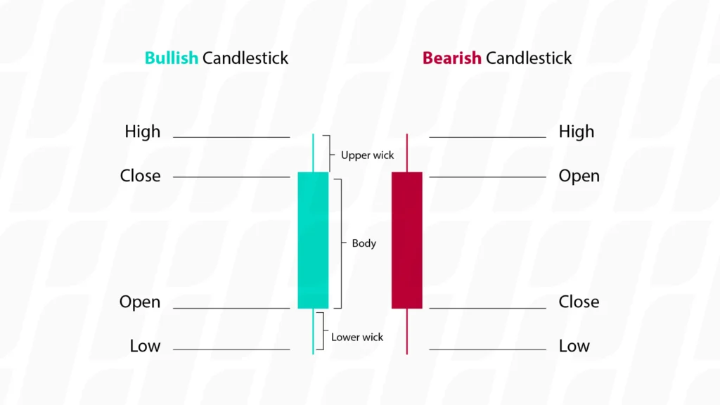
If the price for a day closes higher than its open, the real body is usually coloured green. If the price closes lower than its open, the real body will be coloured red. On some charts, white and black are used (instead of green and red) to denote a positive or negative close on a day. With a single candlestick giving the above mentioned information about a single time period, multiple candlesticks in sequence make up a candlestick chart – which traders observe and interpret possible future price action.
Candlestick chart patterns are a popular tool used in technical analysis to interpret price movements and identify potential trading opportunities. These patterns, formed by the arrangement of individual candlesticks on a chart, provide valuable insights into market sentiment and can indicate trend reversals, continuations, or breakouts.
Candlestick chart patterns are characterised by the shape and arrangement of individual candlesticks. Here are some commonly observed candlestick patterns:
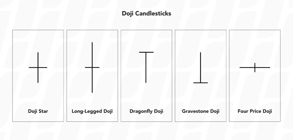
Doji: A doji occurs when the opening and closing prices are very close or equal, resulting in a small or nonexistent body. It suggests indecision in the market and can signal potential trend reversals.
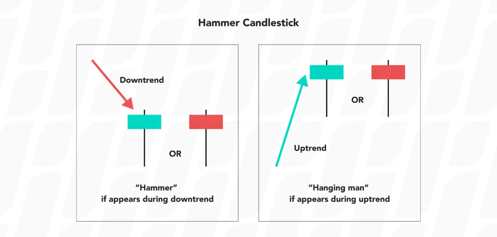
Hammer: A hammer candlestick has a small body located at the upper end of the price range, with a long lower shadow. It often signifies a bullish reversal after a downtrend, indicating that buyers are stepping in.
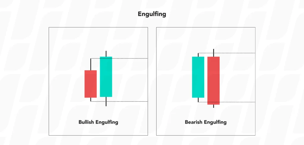
Engulfing: An engulfing pattern occurs when a larger candle completely engulfs the previous smaller candle, indicating a potential trend reversal. A bullish engulfing candle forms when a green (bullish) candle fully engulfs the previous red (bearish) candle, and vice versa for a bearish engulfing candle pattern.

Evening Star: The evening star is a three-candlestick pattern that indicates a potential trend reversal from bullish to bearish. It consists of a large bullish candle, followed by a small-bodied candle (can be bullish or bearish) with a gap, and then a large bearish candle that closes below the midpoint of the first candle.
These are just a few examples of candlestick chart patterns, and there are many more variations that traders analyse to make informed decisions.
In addition to candlestick chart patterns, traders also analyse other chart patterns that provide valuable insights into market dynamics. Support and Resistance Levels and trend lines are two important chart patterns to consider.
Support and resistance levels play a significant role in technical analysis, providing valuable insights into potential price reversals and areas of price congestion. By understanding these key levels, traders can make informed decisions about entry and exit points, as well as manage risk effectively.
Support levels are price levels where buying pressure overcomes selling pressure, causing the price of an asset to pause or “bounce” off. These levels act as a floor for the price, preventing it from falling further. When the price approaches a support level, there is a higher probability of a rebound or a reversal in the upward direction. However, if the price breaks below the support level, it is called a breakout, and the asset may experience further decline until it reaches a new support level.
Resistance levels, on the other hand, represent price levels where selling pressure exceeds buying pressure, hindering the price from advancing further. These levels act as a ceiling for the price, preventing it from rising higher. Traders often perceive resistance levels as potential selling opportunities, as there is a higher probability of a pullback or a reversal in the downward direction when the price approaches a resistance level.
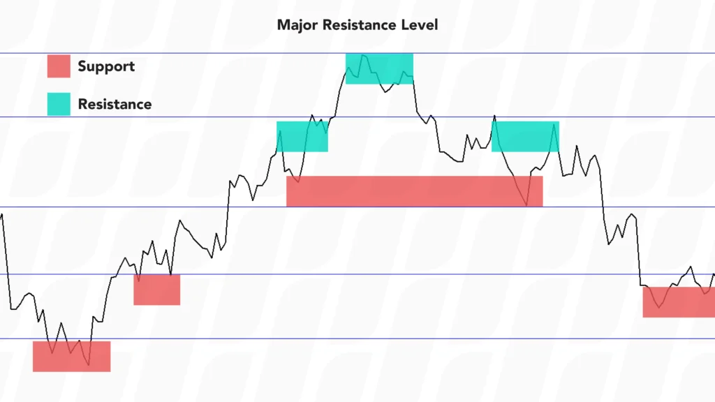
Support and resistance levels can be identified through various methods, such as:
Price Action: Traders analyse historical price movements to pinpoint areas where the price has consistently reversed or stalled in the past. These areas can serve as support or resistance levels.
Trendlines: Trendlines are drawn by connecting the higher lows in an uptrend or the lower highs in a downtrend. In an uptrend, a rising trendline can act as a support level, while in a downtrend, a descending trendline can act as a resistance level.
Horizontal Levels: Traders identify horizontal levels on the chart where the price has previously reversed or stalled multiple times, indicating strong support or resistance. These levels can be determined by swing highs and swing lows.
It’s important to note that support and resistance levels are not precise points but rather zones or areas on the chart. They are influenced by market psychology, supply and demand dynamics, and investor sentiment. Traders incorporate support and resistance analysis into their technical analysis toolkit to enhance their understanding of market dynamics, improve their timing of trades, and better manage risk in the ever-changing financial markets.
“The trend is your friend” is a popular expression used by traders. That’s because trends form the basis of many trading plans. Trendlines are valuable tools in technical analysis that help traders identify and analyse trends in price movements. By understanding how to draw and interpret trendlines, traders can gain insights into the market’s direction, potential reversals, and areas of support and resistance..
A trendline is a straight line drawn on a price chart to connect a series of higher lows in an uptrend or lower highs in a downtrend. By connecting these points, a trendline visually represents the trend direction. Trendlines can be applied to any timeframe, from intraday charts to long-term charts, and they can be used across various financial instruments.
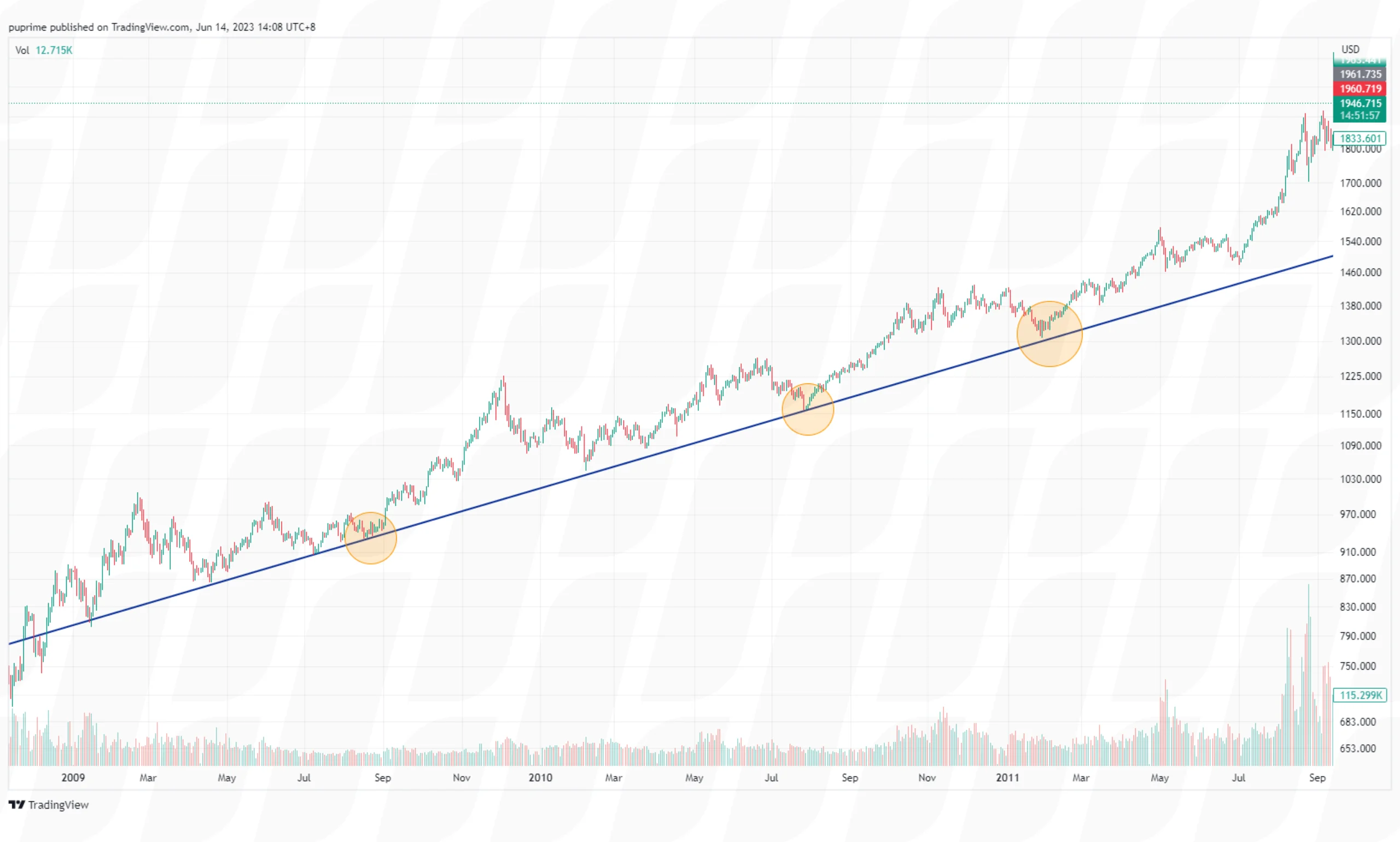
Uptrend Line: An uptrend line is drawn by connecting a series of higher lows. Each subsequent low should be higher than the previous low. An uptrend line serves as a support level, indicating that buyers are in control, and the price is likely to continue rising as long as the trendline remains intact.
Downtrend Line: A downtrend line is drawn by connecting a series of lower highs. Each subsequent high should be lower than the previous high. A downtrend line acts as a resistance level, suggesting that sellers dominate the market, and the price is likely to continue declining as long as the trendline holds.
Trendlines are versatile tools that not only help traders identify trends but also provide valuable insights into potential price targets, support and resistance levels within the trend, and opportunities for trend continuation or reversal.
Trend analysis involves studying the patterns formed by trendlines to assess the strength, duration, and potential reversals of a trend. Here are a few key points to consider when conducting trend analysis:
Trend Confirmation: When multiple points align to form a clear trendline, it strengthens the validity of the trend. The more times the price respects the trendline, the more significant the trend becomes.
Trend Breaks and Reversals: A break in a trendline may indicate a potential trend reversal or a pause in the current trend. Traders often look for confirmation of a trend reversal through additional technical indicators or chart patterns.
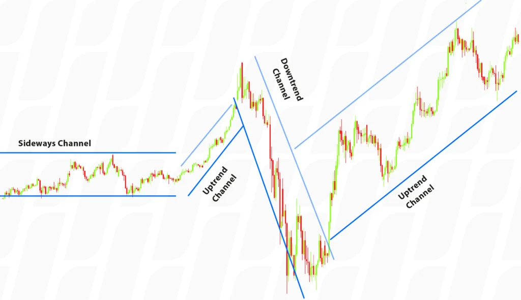
Trend Channels: Trendlines can form parallel channels when both an uptrend and a downtrend line are drawn on a chart. These channels provide a visual framework for price movement and can assist traders in identifying potential support and resistance levels.
Drawing trend channels involves identifying and connecting both an uptrend and a downtrend line on a price chart. Here’s a step-by-step guide on how to draw trend channels:
Identify the Trend: Determine whether the prevailing trend is an uptrend or a downtrend. Look for a series of higher highs and higher lows for an uptrend or lower highs and lower lows for a downtrend.
Draw the Uptrend line: Start by identifying at least two significant higher lows in an uptrend. Draw a straight line connecting these points. The line should slope upward, following the general direction of the price movement.
Draw the Downtrend Line: Next, locate at least two significant lower highs in a downtrend. Draw a straight line connecting these points. The line should slope downward, aligning with the overall price movement.
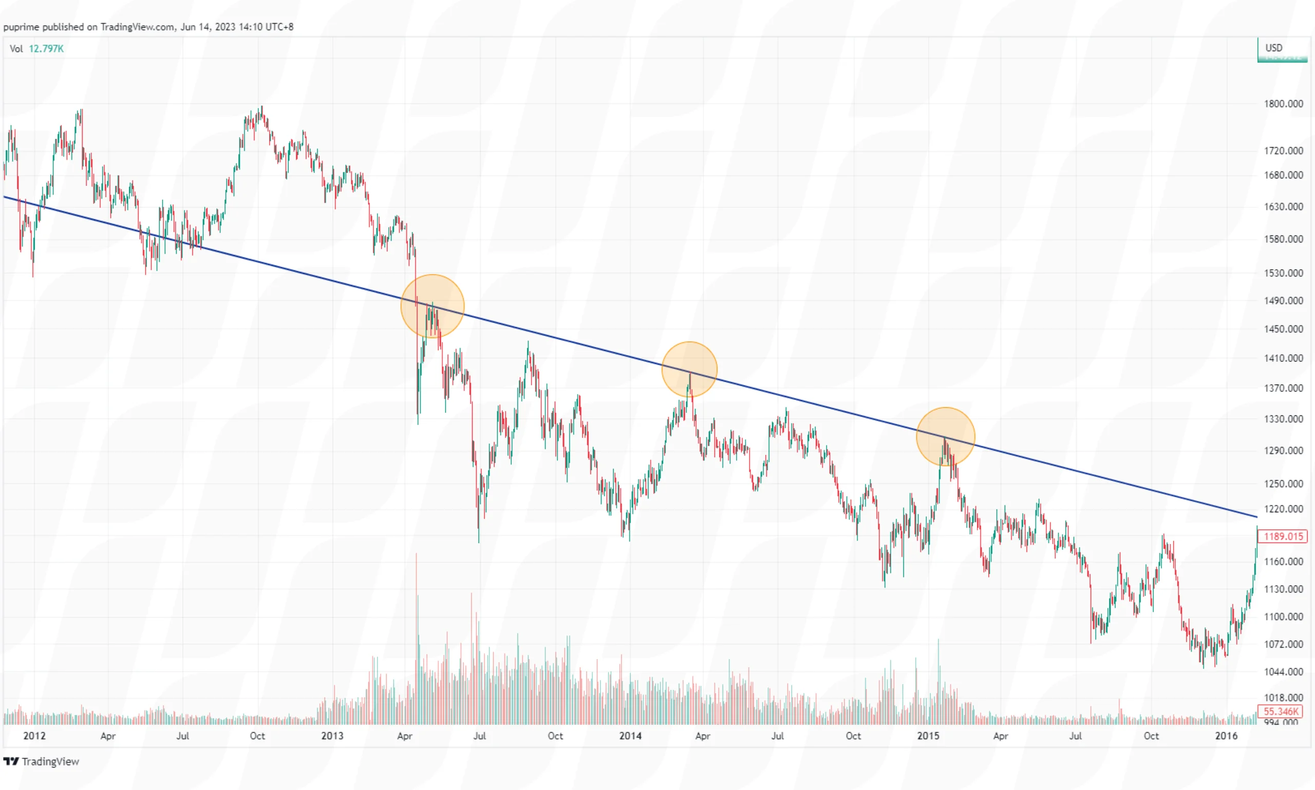
Confirm the Channel: Extend the trendlines in parallel to create the trend channel. Ensure that the channel encompasses most of the price action within the trend, touching the highs and lows of the price bars.
Adjust if Necessary: Sometimes, minor fluctuations or noise in the price chart can make the trendlines less accurate. If needed, adjust the trendlines to align with the significant highs and lows, ensuring that they provide a clear representation of the price movement.
Validate the Channel: To confirm the validity of the trend channel, observe if the price respects the channel boundaries by bouncing off the trendlines. The more times the price touches or reacts to the trendlines, the more reliable the channel becomes.
Trend channels provide traders with insights into potential support and resistance levels within the trend. They can help identify opportunities for trading within the channel, such as buying near the lower trendline in an uptrend or selling near the upper trendline in a downtrend. However, it’s crucial to combine trend channel analysis with other technical tools and risk management strategies for a comprehensive trading approach.
Engulfing: An engulfing pattern occurs when a larger candle completely engulfs the previous smaller candle, indicating a potential trend reversal. A bullish engulfing candle forms when a green (bullish) candle fully engulfs the previous red (bearish) candle, and vice versa for a bearish engulfing candle pattern.

Evening Star: The evening star is a three-candlestick pattern that indicates a potential trend reversal from bullish to bearish. It consists of a large bullish candle, followed by a small-bodied candle (can be bullish or bearish) with a gap, and then a large bearish candle that closes below the midpoint of the first candle.
These are just a few examples of candlestick chart patterns, and there are many more variations that traders analyse to make informed decisions.
In addition to candlestick chart patterns, traders also analyse other chart patterns that provide valuable insights into market dynamics. Support and Resistance Levels and trend lines are two important chart patterns to consider.
Support and resistance levels play a significant role in technical analysis, providing valuable insights into potential price reversals and areas of price congestion. By understanding these key levels, traders can make informed decisions about entry and exit points, as well as manage risk effectively.
Support levels are price levels where buying pressure overcomes selling pressure, causing the price of an asset to pause or “bounce” off. These levels act as a floor for the price, preventing it from falling further. When the price approaches a support level, there is a higher probability of a rebound or a reversal in the upward direction. However, if the price breaks below the support level, it is called a breakout, and the asset may experience further decline until it reaches a new support level.
Resistance levels, on the other hand, represent price levels where selling pressure exceeds buying pressure, hindering the price from advancing further. These levels act as a ceiling for the price, preventing it from rising higher. Traders often perceive resistance levels as potential selling opportunities, as there is a higher probability of a pullback or a reversal in the downward direction when the price approaches a resistance level.

Support and resistance levels can be identified through various methods, such as:
Price Action: Traders analyse historical price movements to pinpoint areas where the price has consistently reversed or stalled in the past. These areas can serve as support or resistance levels.
Trendlines: Trendlines are drawn by connecting the higher lows in an uptrend or the lower highs in a downtrend. In an uptrend, a rising trendline can act as a support level, while in a downtrend, a descending trendline can act as a resistance level.
Horizontal Levels: Traders identify horizontal levels on the chart where the price has previously reversed or stalled multiple times, indicating strong support or resistance. These levels can be determined by swing highs and swing lows.
It’s important to note that support and resistance levels are not precise points but rather zones or areas on the chart. They are influenced by market psychology, supply and demand dynamics, and investor sentiment. Traders incorporate support and resistance analysis into their technical analysis toolkit to enhance their understanding of market dynamics, improve their timing of trades, and better manage risk in the ever-changing financial markets.

“The trend is your friend” is a popular expression used by traders. That’s because trends form the basis of many trading plans. Trendlines are valuable tools in technical analysis that help traders identify and analyse trends in price movements. By understanding how to draw and interpret trendlines, traders can gain insights into the market’s direction, potential reversals, and areas of support and resistance..
A trendline is a straight line drawn on a price chart to connect a series of higher lows in an uptrend or lower highs in a downtrend. By connecting these points, a trendline visually represents the trend direction. Trendlines can be applied to any timeframe, from intraday charts to long-term charts, and they can be used across various financial instruments.
Uptrend Line: An uptrend line is drawn by connecting a series of higher lows. Each subsequent low should be higher than the previous low. An uptrend line serves as a support level, indicating that buyers are in control, and the price is likely to continue rising as long as the trendline remains intact.
Downtrend Line: A downtrend line is drawn by connecting a series of lower highs. Each subsequent high should be lower than the previous high. A downtrend line acts as a resistance level, suggesting that sellers dominate the market, and the price is likely to continue declining as long as the trendline holds.
Trendlines are versatile tools that not only help traders identify trends but also provide valuable insights into potential price targets, support and resistance levels within the trend, and opportunities for trend continuation or reversal.
Trend analysis involves studying the patterns formed by trendlines to assess the strength, duration, and potential reversals of a trend. Here are a few key points to consider when conducting trend analysis:
Trend Confirmation: When multiple points align to form a clear trendline, it strengthens the validity of the trend. The more times the price respects the trendline, the more significant the trend becomes.
Trend Breaks and Reversals: A break in a trendline may indicate a potential trend reversal or a pause in the current trend. Traders often look for confirmation of a trend reversal through additional technical indicators or chart patterns.
Trend Channels: Trendlines can form parallel channels when both an uptrend and a downtrend line are drawn on a chart. These channels provide a visual framework for price movement and can assist traders in identifying potential support and resistance levels.
Drawing trend channels involves identifying and connecting both an uptrend and a downtrend line on a price chart. Here’s a step-by-step guide on how to draw trend channels:
Identify the Trend: Determine whether the prevailing trend is an uptrend or a downtrend. Look for a series of higher highs and higher lows for an uptrend or lower highs and lower lows for a downtrend.
Draw the Uptrend line: Start by identifying at least two significant higher lows in an uptrend. Draw a straight line connecting these points. The line should slope upward, following the general direction of the price movement.

Draw the Downtrend Line: Next, locate at least two significant lower highs in a downtrend. Draw a straight line connecting these points. The line should slope downward, aligning with the overall price movement.

Confirm the Channel: Extend the trendlines in parallel to create the trend channel. Ensure that the channel encompasses most of the price action within the trend, touching the highs and lows of the price bars.
Adjust if Necessary: Sometimes, minor fluctuations or noise in the price chart can make the trendlines less accurate. If needed, adjust the trendlines to align with the significant highs and lows, ensuring that they provide a clear representation of the price movement.
Validate the Channel: To confirm the validity of the trend channel, observe if the price respects the channel boundaries by bouncing off the trendlines. The more times the price touches or reacts to the trendlines, the more reliable the channel becomes.
Trend channels provide traders with insights into potential support and resistance levels within the trend. They can help identify opportunities for trading within the channel, such as buying near the lower trendline in an uptrend or selling near the upper trendline in a downtrend. However, it’s crucial to combine trend channel analysis with other technical tools and risk management strategies for a comprehensive trading approach.
Understand The Basics Of Risk Management In Trading
Technical indicators are essential tools in technical analysis that help traders assess the momentum, strength, and potential reversal points in price movements. These tools are designed to generate signals based on mathematical calculations using historical price data. Technical indicators broadly fall into two categories: leading indicators and lagging indicators.
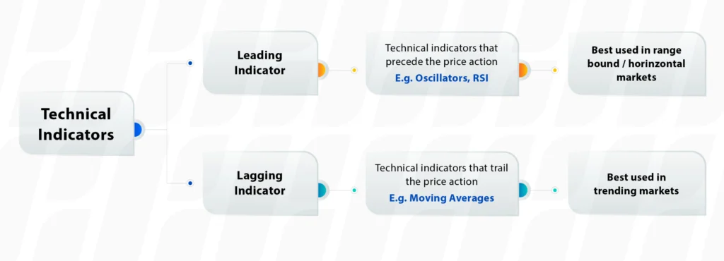
Lagging indicators, also known as trend-following indicators, provide signals after a trend has already been established. They are calculated using historical price data, allowing traders to analyse the strength and sustainability of an ongoing trend. Examples of lagging indicators include moving averages, Moving Average Convergence Divergence (MACD) and Bollinger Bands. These indicators are valuable for confirming trends but may have limitations when it comes to timing entries and exits.
Moving averages, such as the simple moving average (SMA) and exponential moving average (EMA), are essential technical indicators used by traders to analyse price data and make informed trading decisions.
The simple moving average (SMA) calculates the average price of a financial instrument over a specific period. It smoothes out price fluctuations and provides a clearer picture of the overall trend. For example, a 10-day SMA adds up the closing prices of the last 10 days and divides the sum by 10.
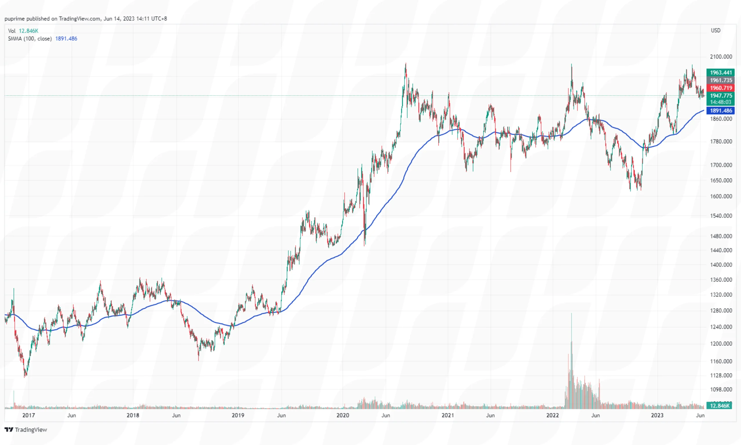
Traders use the SMA as a reliable indicator to identify trends and potential support and resistance levels. When the price is above the SMA, it suggests an uptrend, while a price below the SMA indicates a downtrend. The SMA acts as a reference point for traders to gauge the current market sentiment.
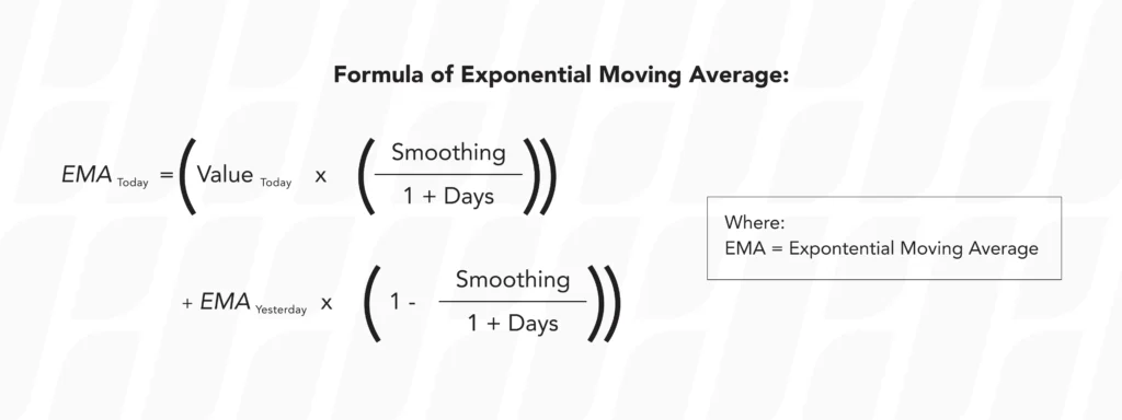
The exponential moving average (EMA) is similar to the SMA, but it gives more weight to recent price data. The EMA responds more quickly to price changes, making it popular among traders who focus on shorter-term trends. The EMA formula assigns exponentially decreasing weights to historical prices, with more weight given to recent data points.
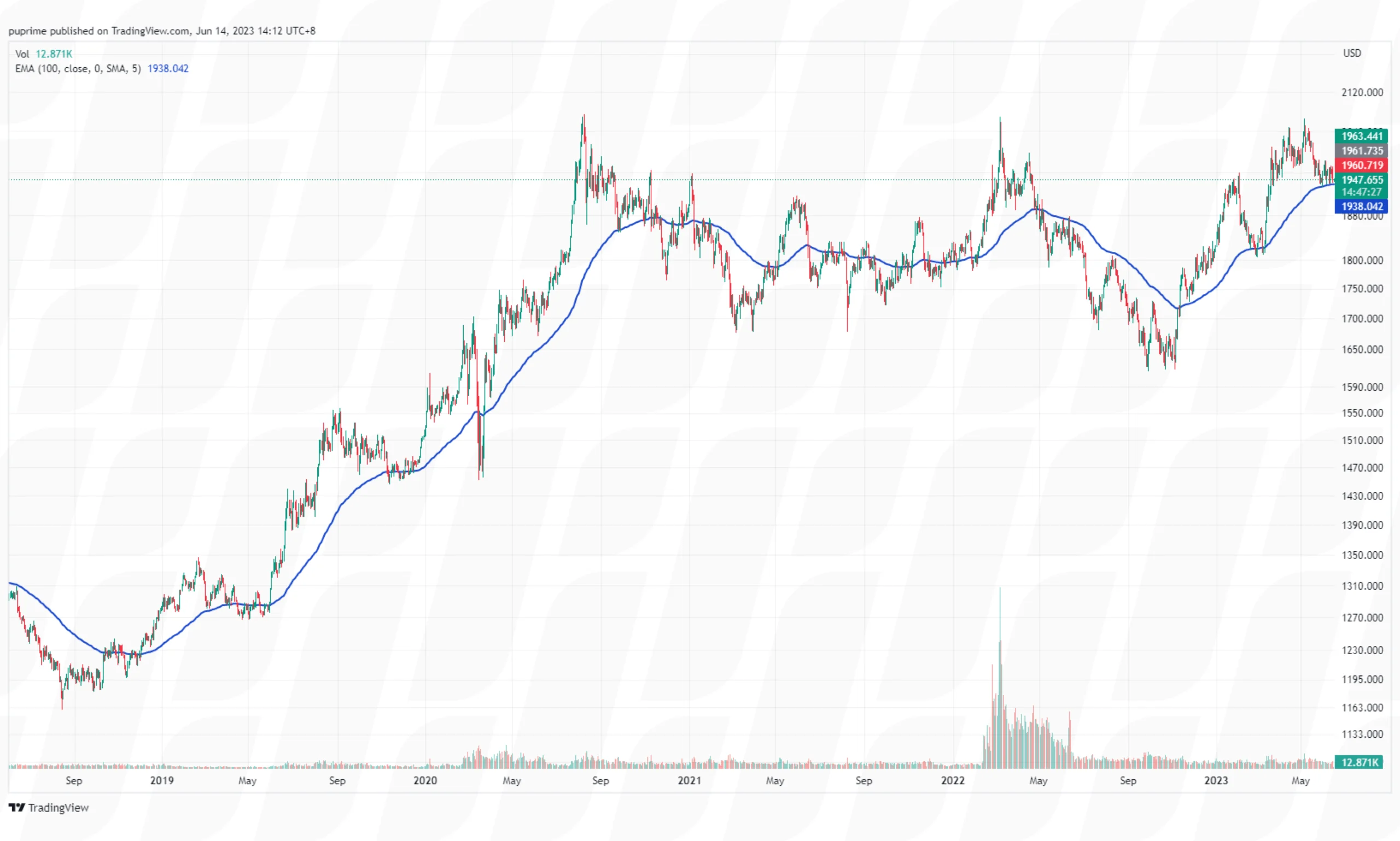
With its enhanced responsiveness, the EMA helps traders identify shorter-term trends and potential entry and exit points. The EMA is particularly useful for short-term traders who need a more immediate interpretation of market conditions.
Simple Moving Averages (SMA) and Exponential Moving Averages (EMA) are two commonly used types of moving averages in technical analysis. While both are effective in smoothing out price data and identifying trends, they differ in terms of calculation methodology and responsiveness to recent price changes. Let’s compare the two:
1. Calculation Methodology
Simple Moving Average (SMA): The SMA is calculated by taking the sum of a specified number of closing prices over a given period and dividing it by the number of periods. For example, a 10-day SMA would be the sum of the last 10 closing prices divided by 10.

Exponential Moving Average (EMA): The EMA is more complex in its calculation. It assigns exponentially decreasing weights to the historical prices, with more weight given to recent data points. The EMA formula incorporates a smoothing factor that determines the weightage assigned to each price data point.
2. Responsiveness To Price Changes
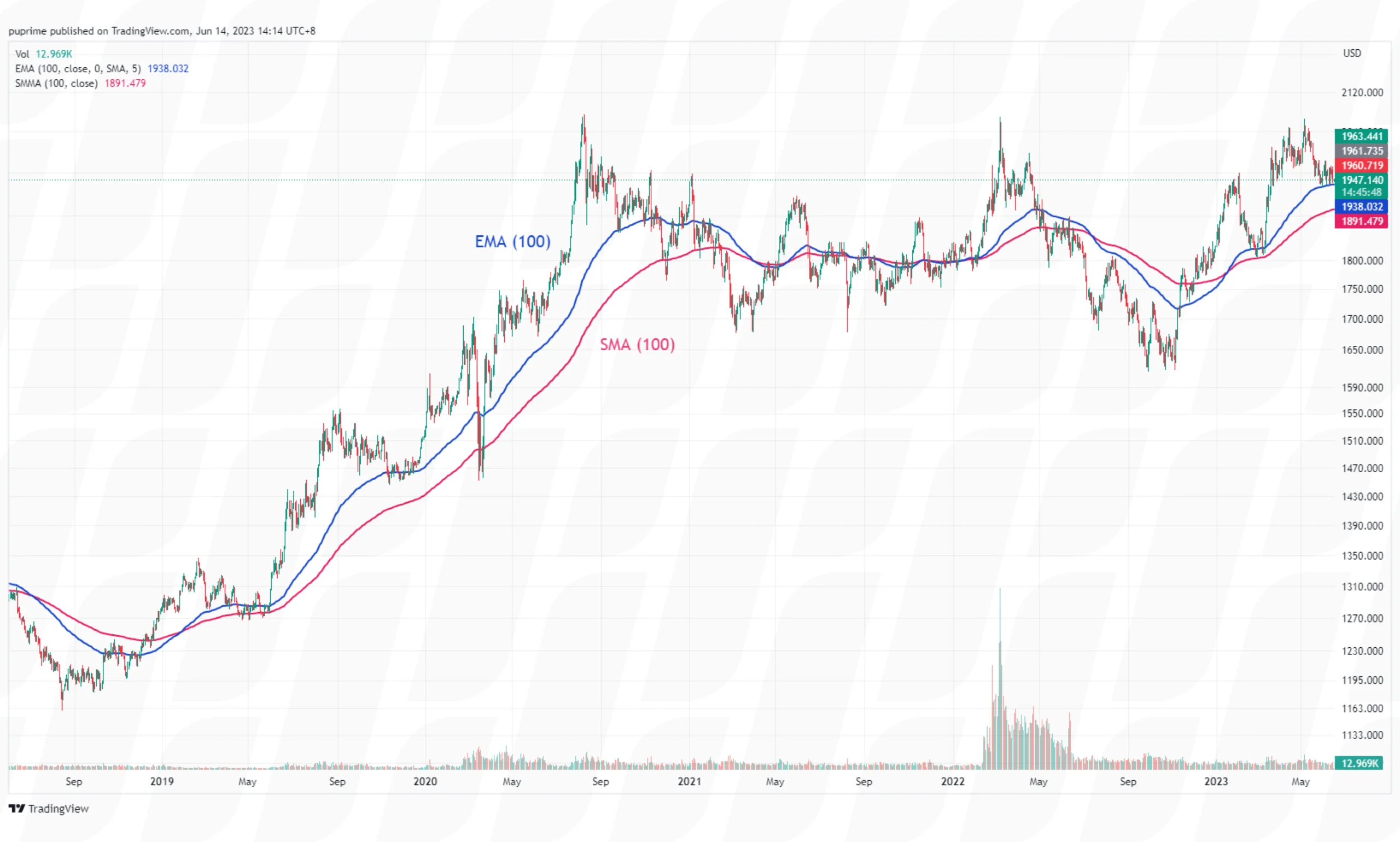
SMA: The SMA provides a simple average of the price data over a specific period. It gives equal weight to each price point, which means it responds more slowly to recent price changes. As a result, the SMA tends to provide a smoother and more lagging representation of the price trend.
EMA: The EMA gives more weight to recent price data, making it more responsive to price changes compared to the SMA. The most recent prices have a higher impact on the EMA calculation, allowing it to react quickly to market conditions. This responsiveness makes the EMA more popular among short-term traders.
3. Trend Identification
SMA: Due to its lagging nature, the SMA is better suited for identifying longer-term trends. It smoothes out short-term price fluctuations and provides a broader view of the market. Traders often use longer-period SMAs, such as the 50-day or 200-day SMA, to assess the overall direction of the market.
EMA: The EMA is favoured for identifying shorter-term trends. Its responsiveness to recent price changes allows traders to capture more immediate shifts in market sentiment. Shorter-period EMAs, like the 20-day or 50-day EMA, are commonly used to analyse shorter-term price movements.
4. Signal Generation
SMA: Since the SMA is less responsive to recent price changes, its signals are typically generated after a trend has already been established. Traders often look for crossovers between different SMA periods (e.g., a 50-day SMA crossing above a 200-day SMA) as potential entry or exit signals.
EMA: The EMA’s responsiveness makes it capable of generating signals earlier in a trend. Traders frequently utilise EMA crossovers (e.g., 20-day EMA crossing above a 50-day EMA) to identify potential buying or selling opportunities.
Moving Average Convergence Divergence (MACD) is a popular and widely used momentum oscillator in technical analysis. It helps traders identify potential trend reversals, generate buy and sell signals, and assess the strength of price momentum. The MACD consists of two main components: the MACD line and the signal line, along with a histogram.
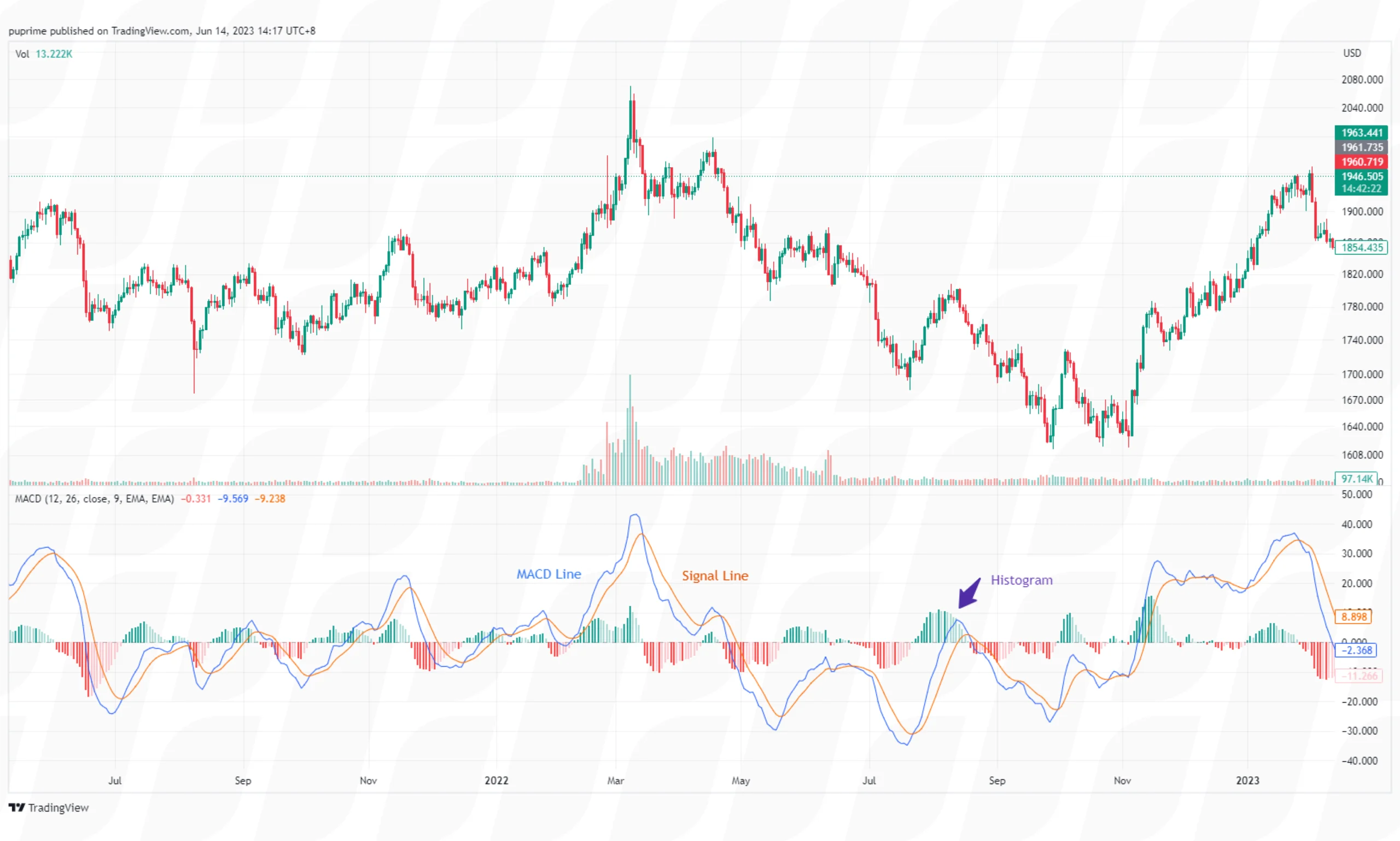
The MACD line is calculated by subtracting the longer-term Exponential Moving Average (EMA) from the shorter-term EMA. The resulting line represents the difference between these two moving averages and aims to capture changes in price momentum. Typically, the shorter-term EMA is calculated over a period of 12 days, while the longer-term EMA is calculated over a period of 26 days. However, these values can be adjusted based on individual preferences and the specific market being analysed.

The signal line is a Moving Average of the MACD line itself. It is commonly calculated using a 9-day EMA. The signal line helps smooth out the MACD line’s fluctuations and provides additional insights into potential trend reversals or confirmations.
The MACD histogram represents the difference between the MACD line and the signal line. It is plotted as a series of vertical bars, with positive values indicating bullish momentum and negative values indicating bearish momentum. The width and height of the histogram bars provide visual cues about the strength of the price momentum.
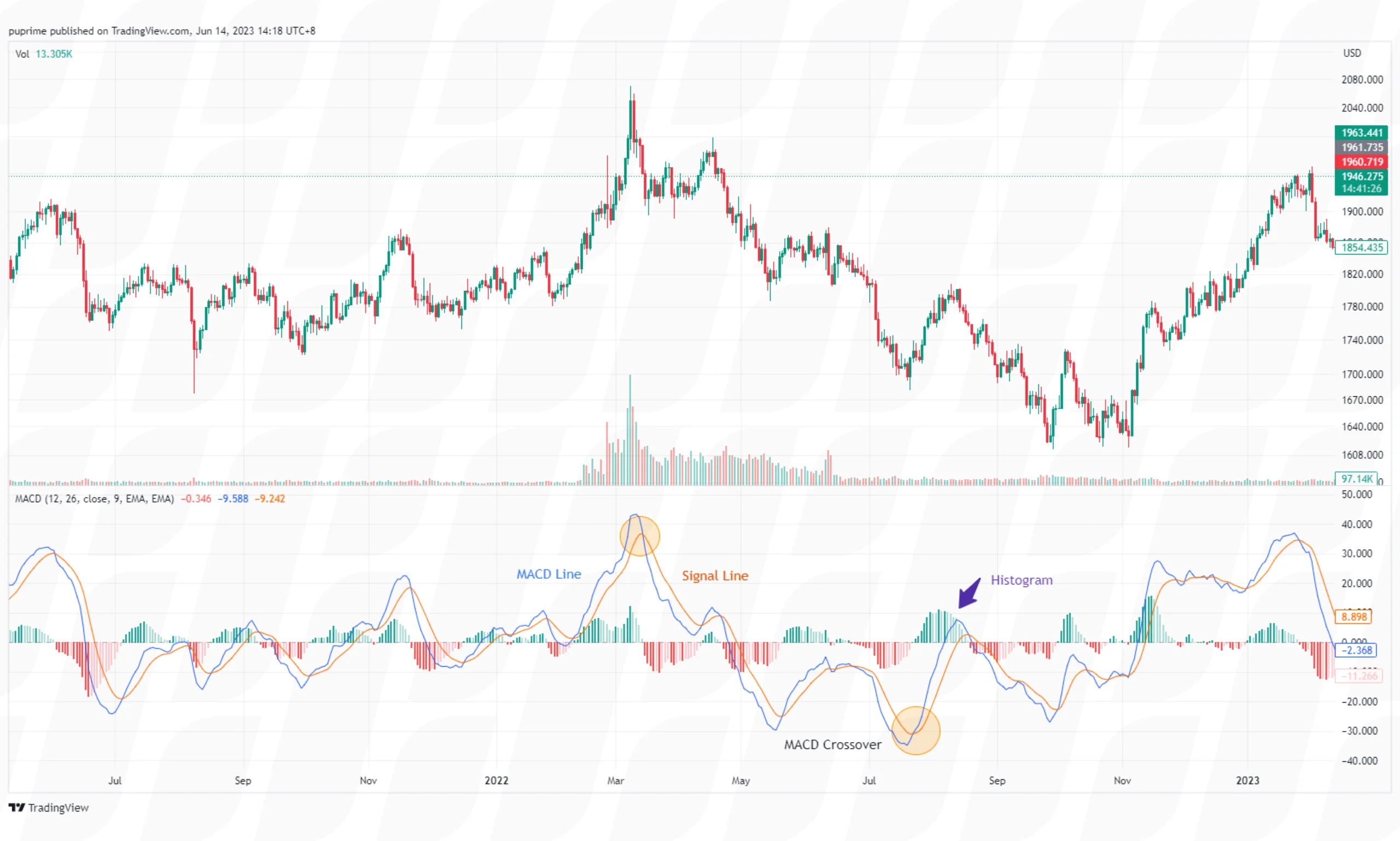
Crossovers: When the MACD line crosses above the signal line, it generates a bullish crossover, suggesting a potential buying opportunity. Conversely, when the MACD line crosses below the signal line, it generates a bearish crossover, indicating a potential selling opportunity.
Divergence: MACD divergence occurs when the MACD line diverges from the price action. Bullish divergence occurs when the price makes lower lows while the MACD line forms higher lows, indicating potential upside momentum. Bearish divergence occurs when the price makes higher highs while the MACD line forms lower highs, suggesting potential downside momentum.
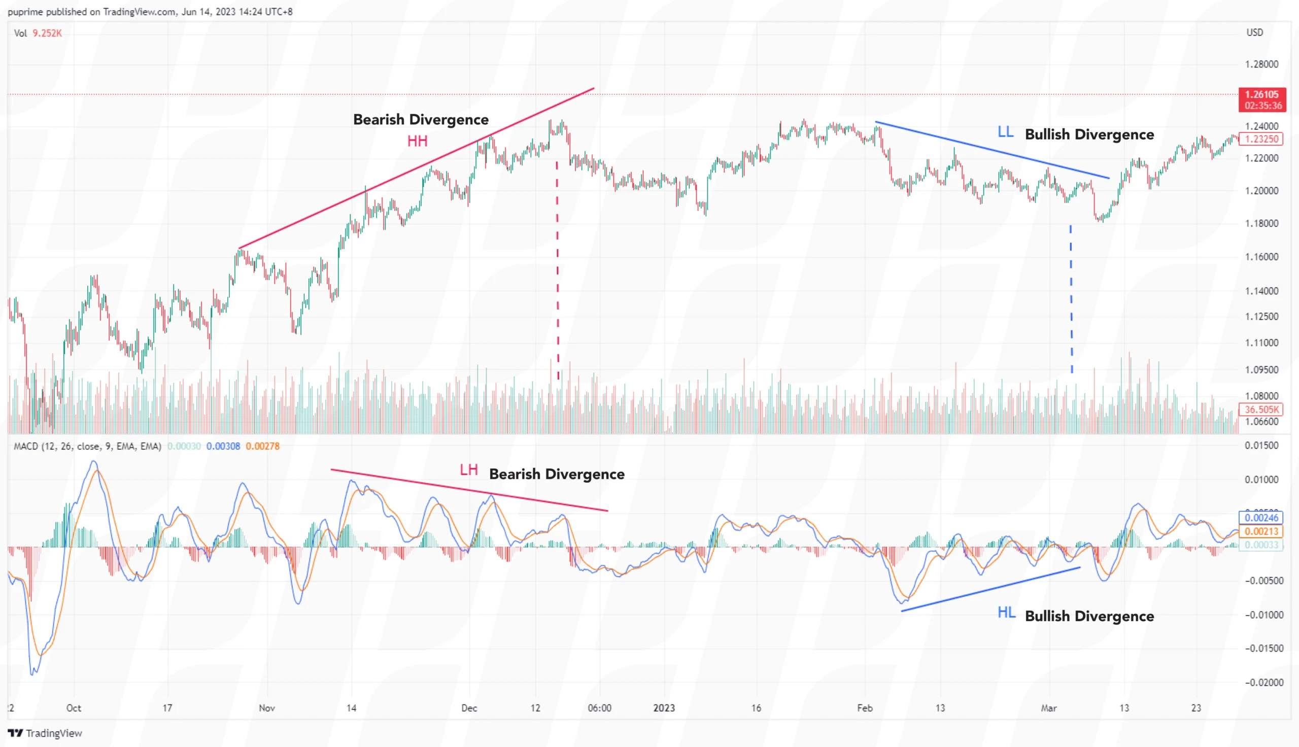
Overbought/Oversold Conditions: Traders also use the MACD to identify overbought and oversold conditions. When the MACD line reaches extreme levels above the zero line, it suggests an overbought condition and potential exhaustion of bullish momentum. Conversely, when the MACD line reaches extreme levels below the zero line, it suggests an oversold condition and potential exhaustion of bearish momentum.
The MACD is a versatile technical indicator that can be applied to various time frames and financial instruments. Traders often use it in conjunction with other technical indicators or chart patterns to confirm potential trade setups.
The Bollinger Bands is an analytical tool based on the SMA and used by traders in technical analysis to identify a market’s volatility and looks at the levels of current prices relative to previous trades. This gives a trader a higher chance of identifying when an asset is overbought or oversold. The tool is named after its creator, John Bollinger, a well-known technical trader.
In its basic form, a Bollinger Band is two “bands” on a chart plotted around an SMA line. There is an upper band, drawn two standard deviations above the line; and a lower band, drawn two standard deviations below the line.
Because it is calculated from a moving average, the Bollinger Bands function as a dynamic form of support and resistance, meaning that the levels change according to how volatile a price movement is.
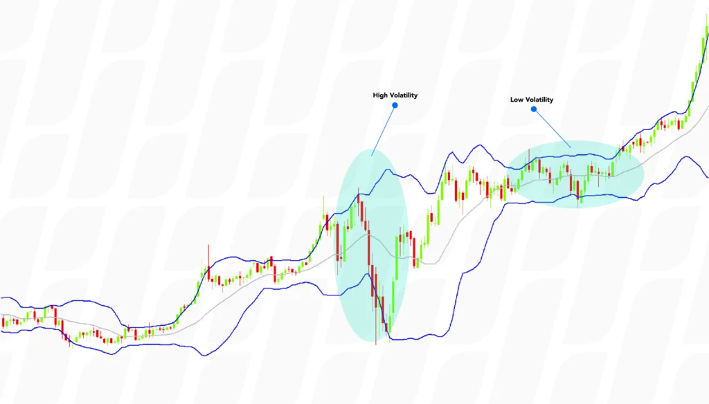
From the above graph, we can see that in times of low volatility, the bands are narrow. As the market becomes increasingly volatile, the bands expand, creating more space between the support and resistance levels.
Because the upper and lower bands function as a form of resistance and support, we often see that the prices deviating within the bands will tend to return to the middle. This is what is sometimes known as the Bollinger Bounce.
Another signal to look out for is when the bands “squeeze” together. This happens when volatility is low – which many traders see as an indication of a pending breakout in the market. If the graph is seen moving towards, and breaking the upper band, then a bullish trend is usually expected. The opposite is true when the candlestick approaches the lower bound.
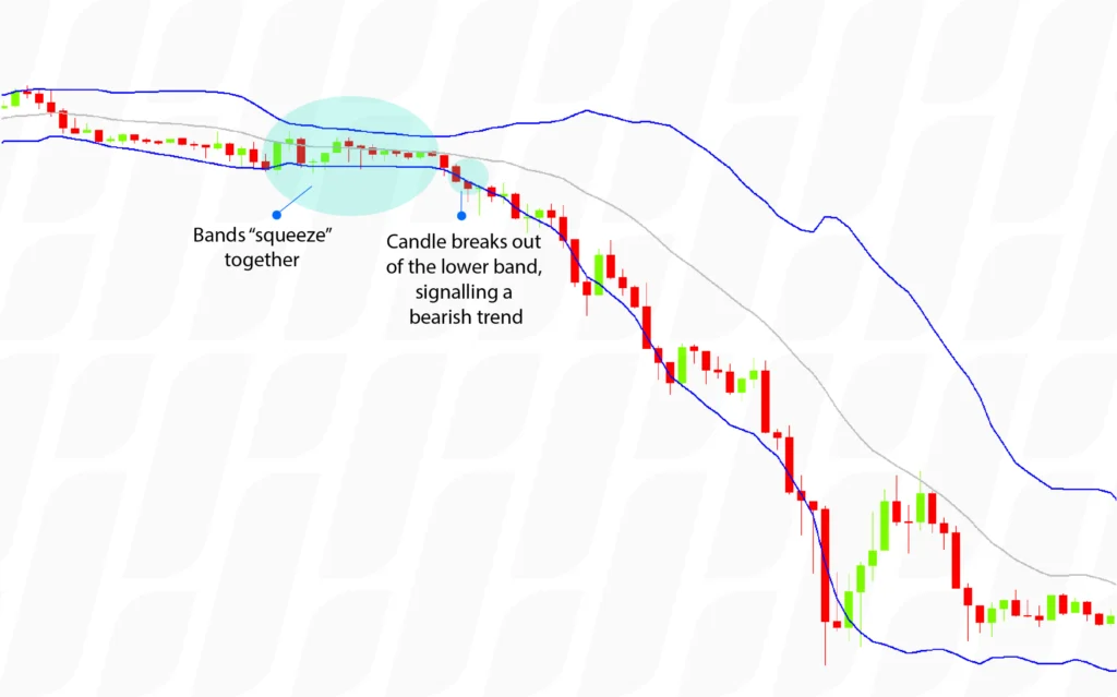
A Bollinger squeeze is not a common occurrence. When looking at a 15-minute candlestick chart, it will be experienced only a few times a week.
Leading indicators, also known as momentum or oscillating indicators, provide signals in advance of potential trend reversals or changes in price direction. These indicators aim to identify overbought and oversold conditions, helping traders anticipate possible trend shifts. Examples of leading indicators include the Relative Strength Index (RSI), Fibonacci Retraction and Extensions, and Stochastic Oscillator. Leading indicators are valuable for identifying potential entry and exit points but should be used in conjunction with other tools for confirmation.
The Relative Strength Index (RSI) is a momentum indicator that determines the speed and change of price movements. It allows traders to measure the buying or selling momentum of a product.
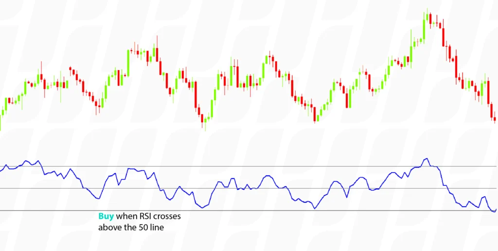
The RSI oscillates between 0 and 100. While it can vary based on the current price trend or a trader’s personal choice, an asset is generally thought to be overbought when the RSI goes above 70; and oversold when it goes below 30. Traders ought to go for “buy” when the RSI crosses above the 50 line and “sell” when the RSI crosses below the 50 line.
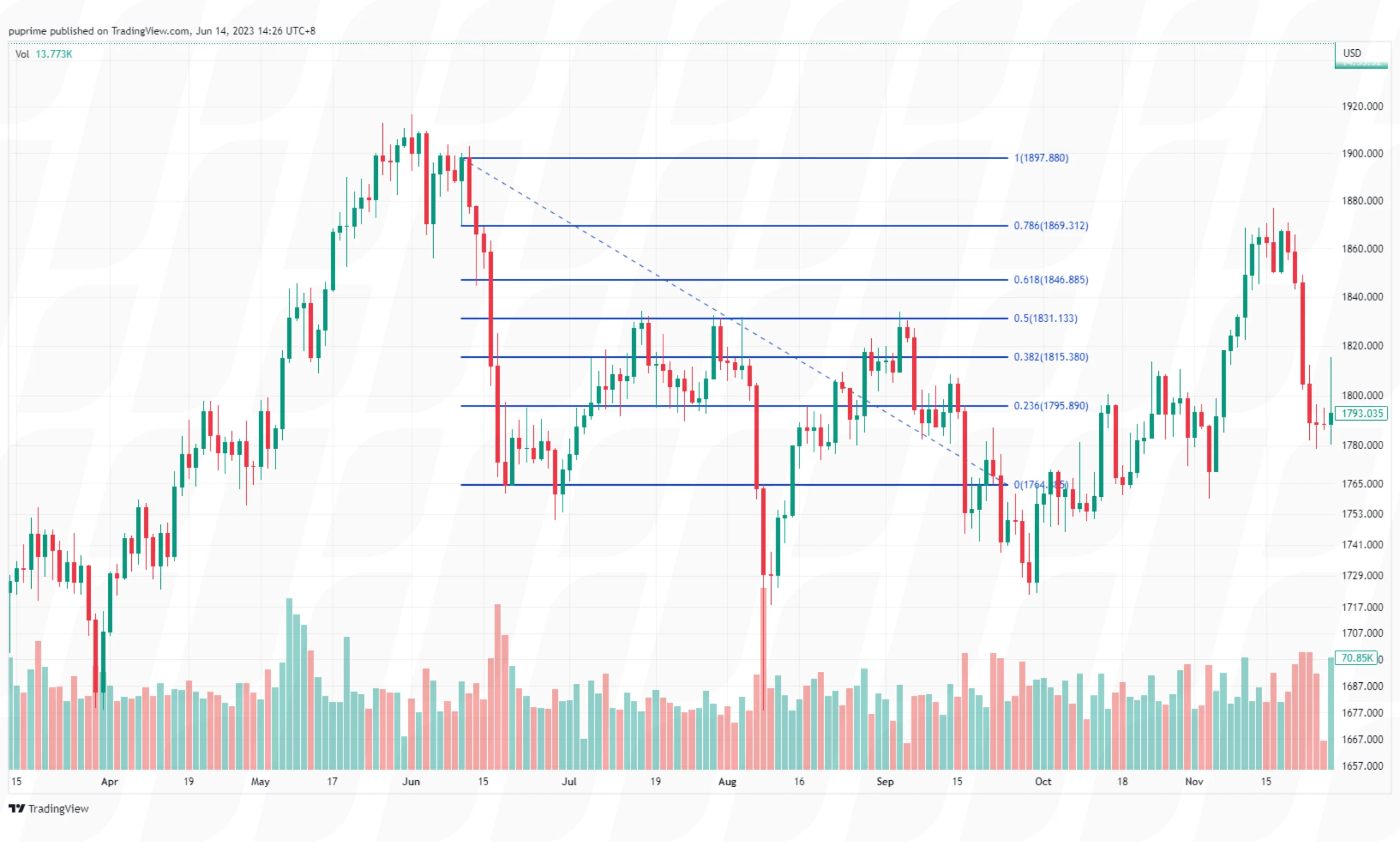
Fibonacci retracement and extensions are powerful tools used in technical analysis to identify potential support and resistance levels in price movements. These tools are based on the Fibonacci sequence, a mathematical concept that has found application in various fields, including financial markets. Let’s delve into the fundamentals of Fibonacci levels and how Fibonacci tools can be employed for retracements and extensions in price analysis.
Fibonacci levels are horizontal lines drawn on a price chart, representing potential areas where price reversals or extensions may occur. These levels are derived from ratios that emerge from the Fibonacci sequence, such as 0.382, 0.500, 0.618, and others. The key Fibonacci levels commonly used are 23.6%, 38.2%, 50%, 61.8%, and 78.6%. These levels are considered significant as they often coincide with natural market retracements and extensions.
Fibonacci retracement and extension tools assist traders in identifying potential areas of support and resistance, allowing them to make informed trading decisions. Here’s how these tools are applied:
1. Fibonacci Retracement
2. Fibonacci Extension
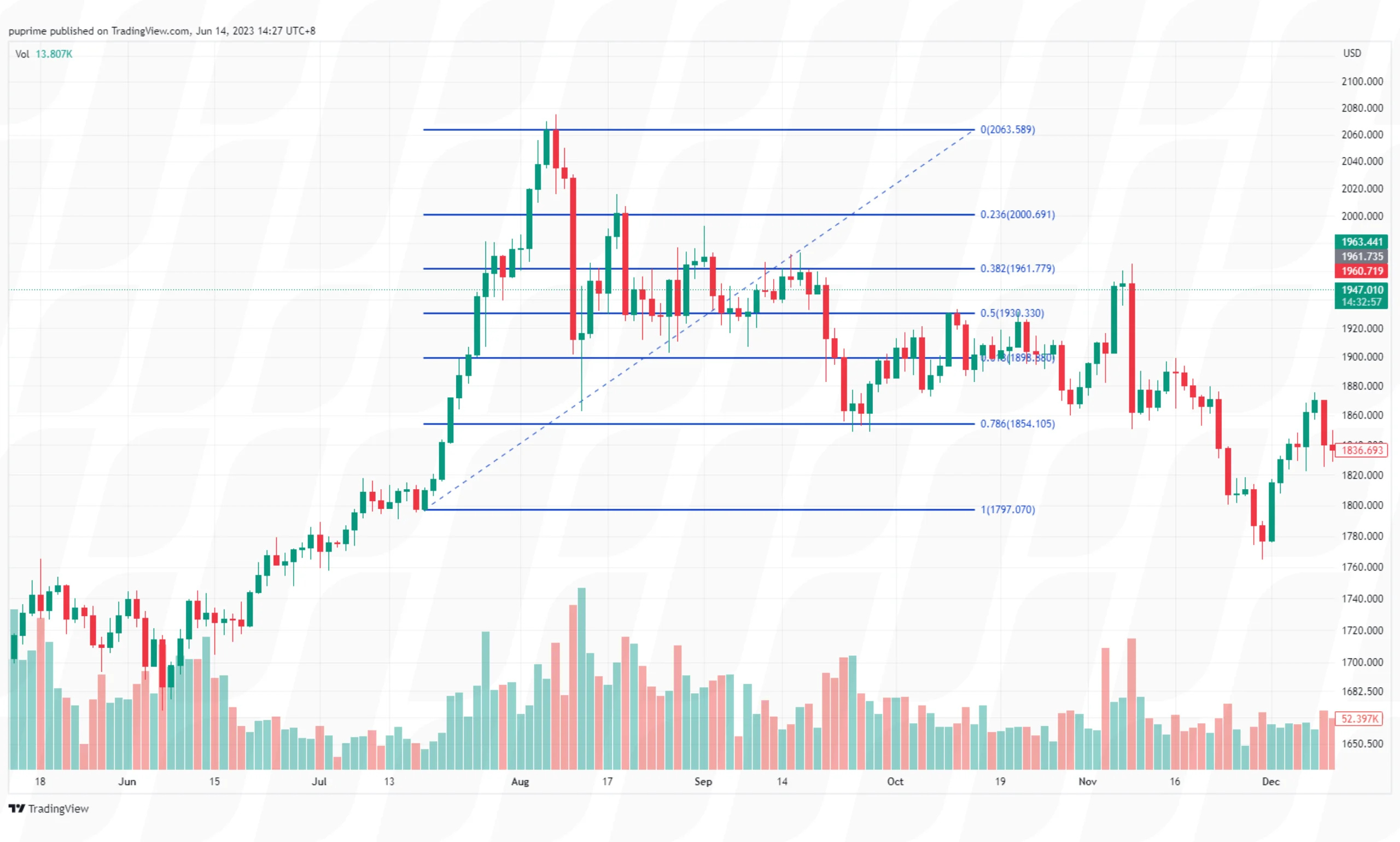
Fibonacci retracement and extensions are essential components of technical analysis. Incorporating Fibonacci retracement and extension tools into a comprehensive trading strategy empowers traders to identify key levels, anticipate price movements, and execute trades with enhanced precision.
The Stochastic Oscillator is a momentum indicator that measures the speed of change of price or the impulse of price. It does this by comparing an asset’s closing price against its price range over a given time period.
Similar to the RSI, Stochastic Oscillators also have levels that indicate potential trends or points of entry or exit
Traders will often look to sell when the Stochastic Oscillator line rises above 80 predicting that it will inevitably then fall back below. Traders will also look to buy when the level falls below 20 predicting that it will increase above this level.
Another way of utilising stochastic oscillators is to watch timing trades. The graph below gives an example of this:
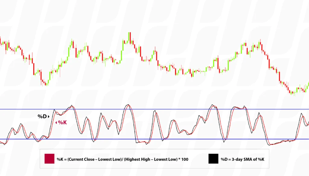
The %K is called the faster moving of the two lines and compares the latest closing price to the recent trading range. %D is a signal line calculated by smoothing out %K; It is a 3-day simple moving average of %K which is plotted alongside %K to act as a signal or trigger line.
Traders will look to sell when the %K (Fast) line shifts below the %D (Slow) line and will look to buy when the %K line shifts over the %D line.
The theory behind this indicator is that in an upward-trending market, prices tend to close near their high, and during a downward-trending market, prices tend to close near their low. Transaction signals occur when the %K crosses through a three-period moving average called the “%D”.
The sensitivity of the oscillator can be adjusted by changing the time period for the %D or %K lines.
Overbought and oversold are terms used in technical analysis to describe extreme price conditions in financial markets. They indicate that the price of an asset has reached levels that may be unsustainable and could potentially reverse or correct in the near future. Technical indicators play a crucial role in identifying overbought and oversold situations and providing traders with valuable insights. Here’s a detailed explanation:
1. Overbought
In technical analysis, overbought refers to a situation where the price of an asset has risen too far or too fast, potentially exceeding its intrinsic value. It suggests that buying pressure may have become excessive, and the asset is potentially overvalued. Traders often interpret overbought conditions as a signal that the price is due for a potential reversal or correction to more sustainable levels.
2. Oversold
Conversely, oversold refers to a situation where the price of an asset has declined significantly or rapidly, potentially falling below its intrinsic value. It suggests that selling pressure may have become excessive, and the asset is potentially undervalued. Traders often interpret oversold conditions as a signal that the price is due for a potential rebound or upward correction to more reasonable levels.
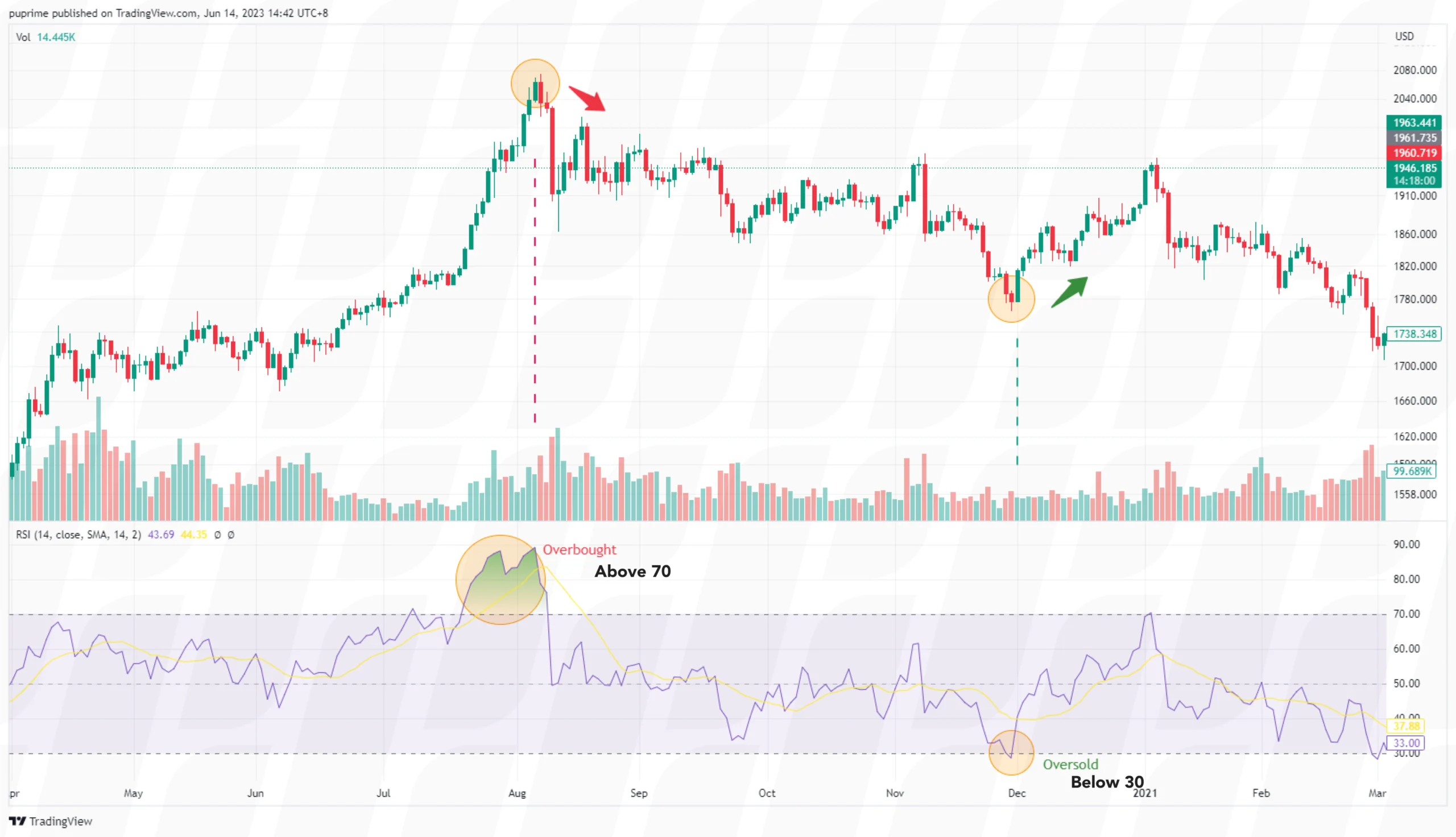
Technical indicators such as the Relative Strength Index (RSI) and Stochastic Oscillator help quantify and identify overbought and oversold conditions. By measuring the price’s speed and magnitude of recent movements, these indicators indicate whether an asset is potentially overbought or oversold. Overbought or oversold readings from technical indicators act as potential warning signals for traders. They indicate that a price reversal or correction may be imminent, prompting traders to exercise caution or consider adjusting their positions.
Technical indicators can also provide traders with potential entry and exit points. When an asset is in an overbought condition, traders may consider selling or taking profits. Conversely, when an asset is in an oversold condition, traders may consider buying or entering positions. However, it’s important to note that technical indicators should not be relied upon as standalone signals, and traders should consider other factors and confirmatory signals before making trading decisions.
While technical analysis focuses on studying price patterns, trends, and indicators, fundamental analysis also encompasses various economic factors that can influence the financial markets. This includes macroeconomic indicators such as GDP growth, interest rates, inflation, employment data, consumer spending, and government policies. Both approaches offer valuable insights into the market, and integrating them can provide a comprehensive understanding for traders and investors. By combining the strengths of fundamental analysis, such as analysing financial statements, industry trends, and economic factors, with the insights derived from technical analysis, including chart patterns, indicators, and market sentiment, traders can make more informed decisions.
Learn More About Fundamental Analysis
In the fast-paced and dynamic world of financial markets, technical analysis serves as a valuable tool for traders and investors seeking to navigate the complexities of price movements. By understanding the basics of technical analysis, including price charts, chart patterns, trendlines, oscillators, and indicators, individuals can gain insights into market trends, identify potential entry and exit points, and manage risk effectively.
Start Trading With PU Prime

以行业低点差和闪电般的执行速度交易外汇、指数、贵金属等。
